
How to Make a Radial Chart in Google Slides: From Data to Impact
Jun 19, 2023
Do you want to create a visually attractive radial chart for your next business presentation?
Creating a radial chart in Google Slides is easy, especially when you follow our guide. By the end of this article, you'll know how to use a radial chart to compare multiple variables. This way, you can convince partners and stakeholders to trust your company's business plans.
This article will cover the following topics:
-
Make a radial chart in your Google Slides presentation
-
Add labels to your radial chart
-
Add chart titles and information text boxes to your radial diagram
-
Customize the outer body and inner body of your radial chart
-
Frequently asked questions about making radial diagrams on Google Slides

Make a Radial Chart in Your Google Slides Presentation
Learning to create a radial chart on Google Slides shouldn't be a struggle. Follow these steps:
-
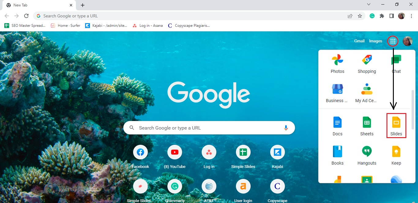
Launch Google Chrome and click the "Google Apps" icon. Select "Google Slides."
-
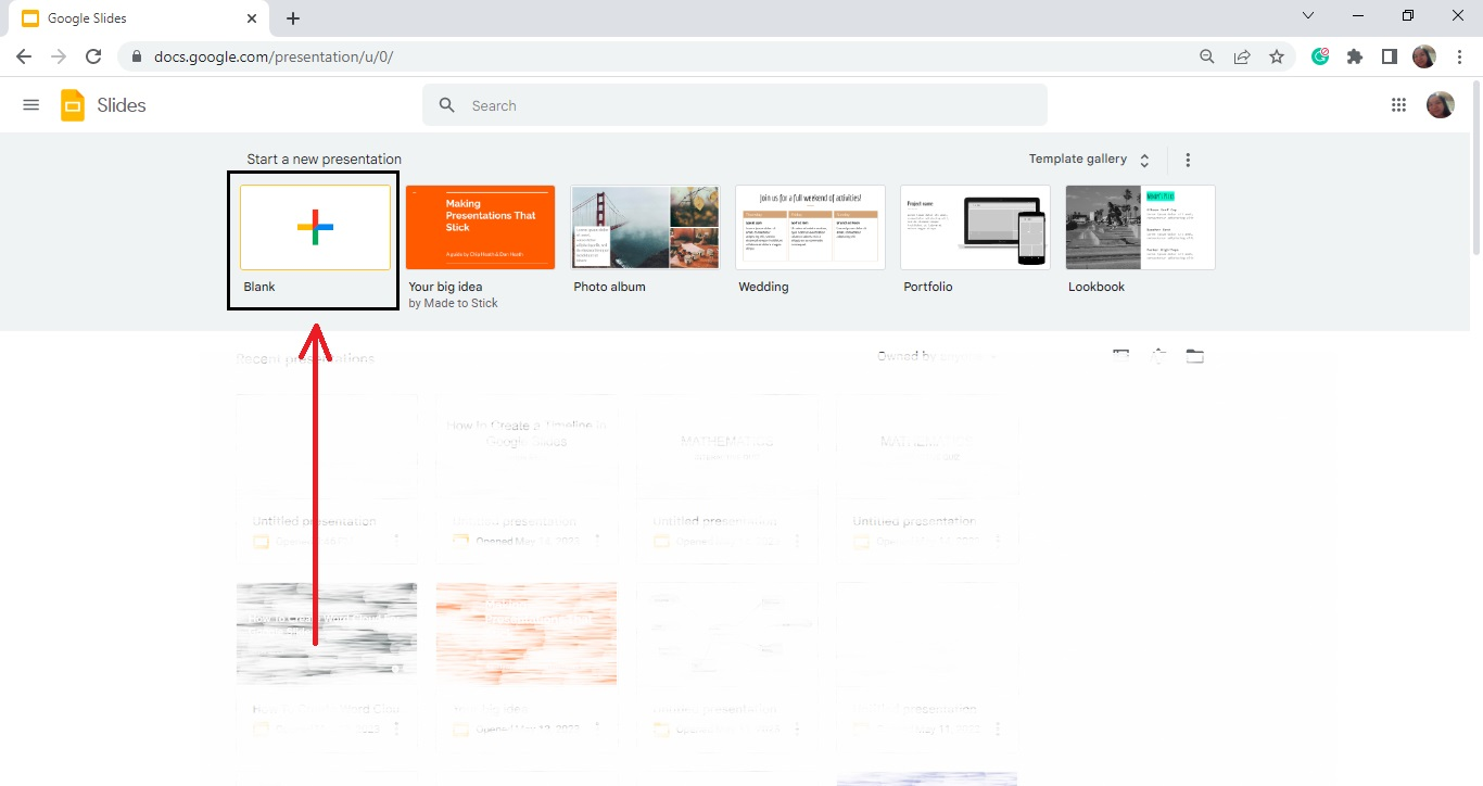
Select a blank presentation under the Google Slides tab.
-
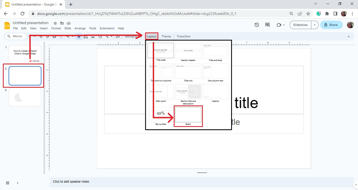
Click the "+" sign on the toolbar to add a new slide. Then, click "Layout" and select the blank slide layout.
-
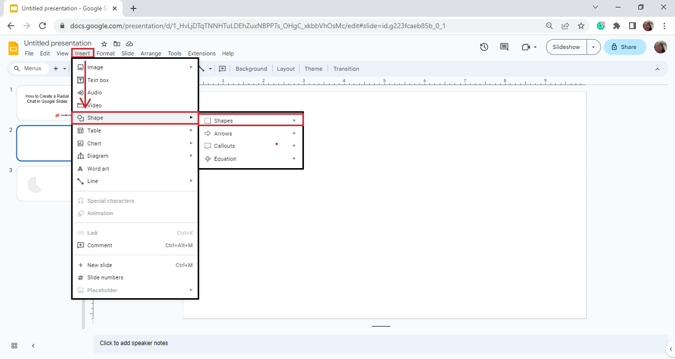
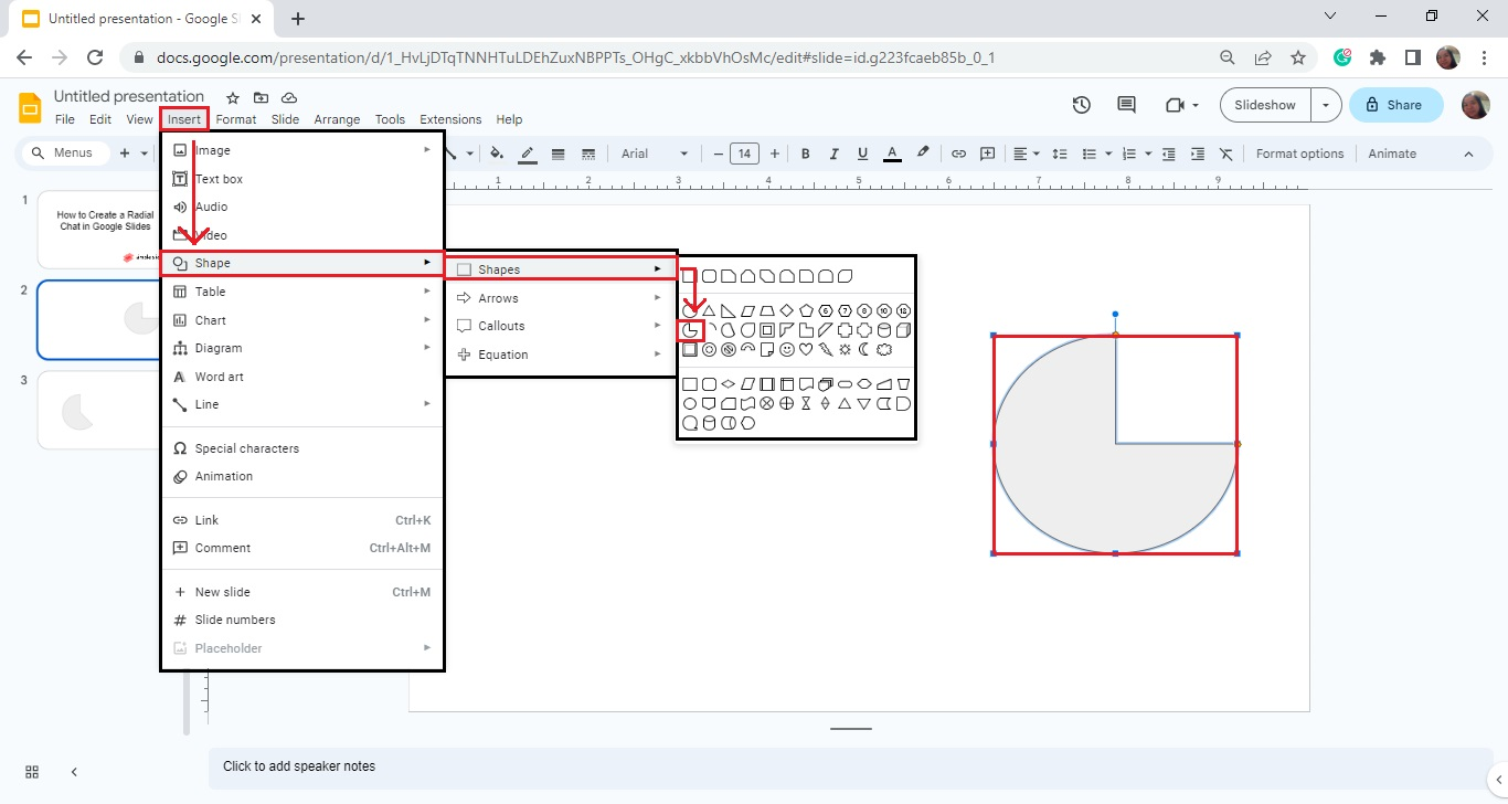
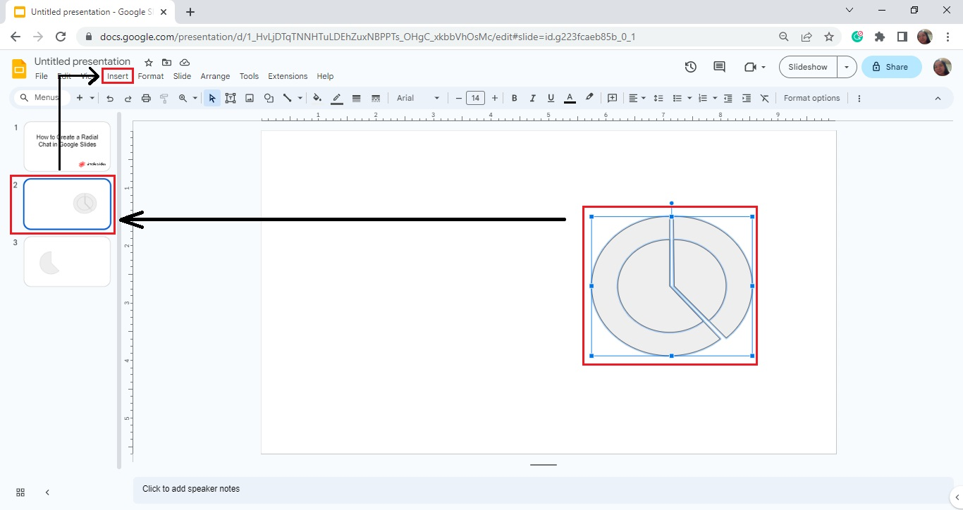
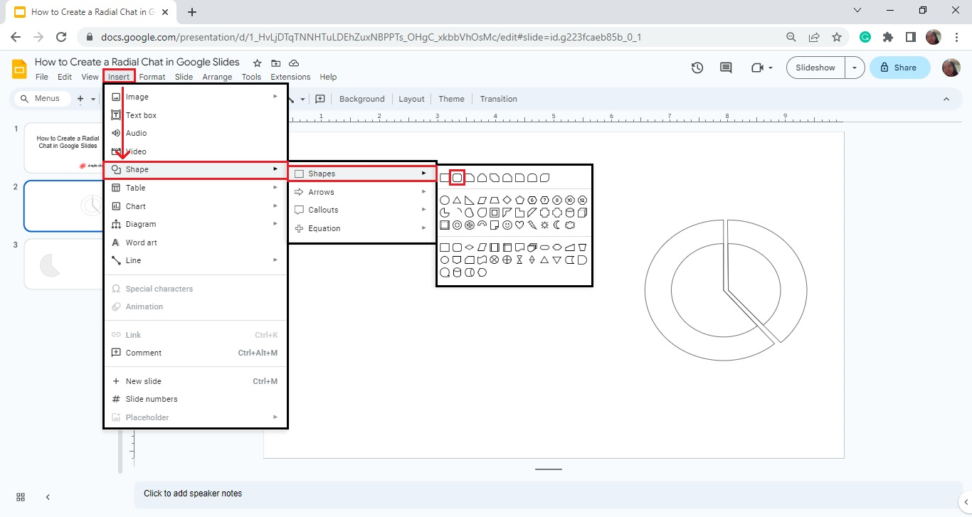
Go to the "Insert" menu, and click Shape -> Shapes.
-
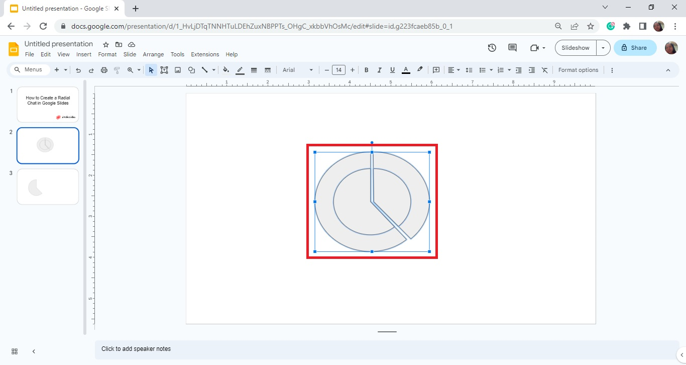
Then, select the "Pie" chart icon and drag it to your slide deck.
-
Once your "Pie" icon appears on your slide deck, click it and resize the pie chart to your specific scale for your radial charts.
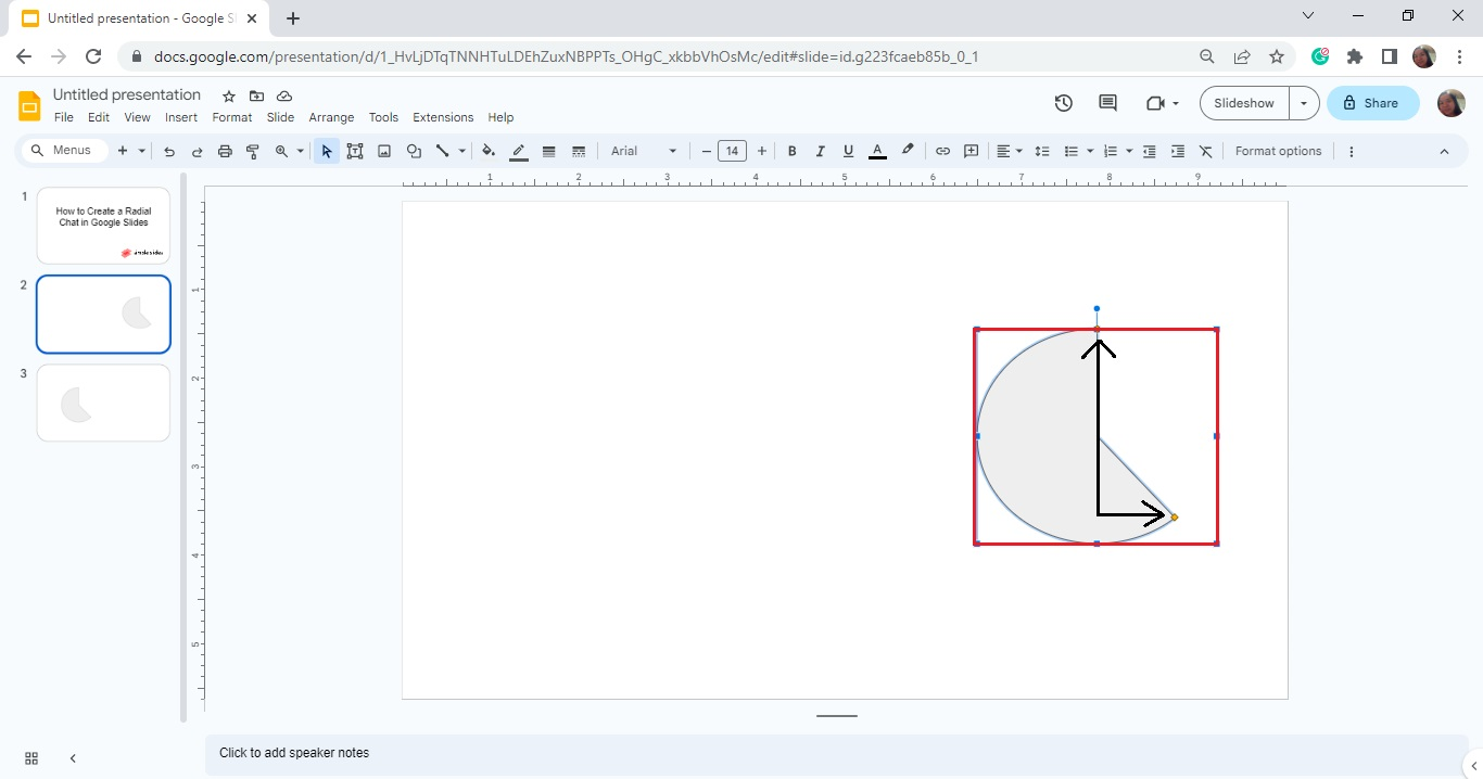
-
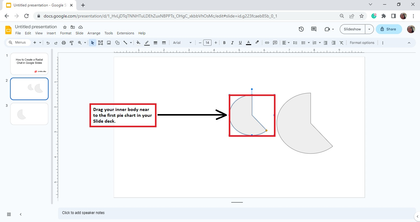
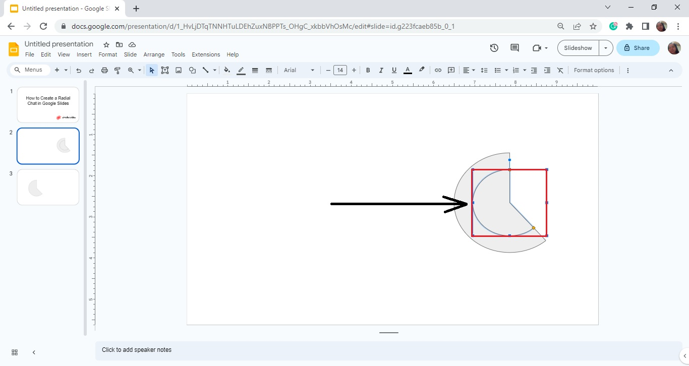
Click and duplicate the "Pie" icon on your slide deck and resize it to create an inner shape for your chart.
-
Then, move the other half of your radial chart closer to the pie chart you created earlier.
-
Repeat Steps 6 and 7 to create an inner body for the other half of the shape. Once you've done that, you'll have a whole radial chart on your slide deck.
Quick Tip: Check out our post about how to add border color in Google Slides to learn how you can customize your radial chart's look.
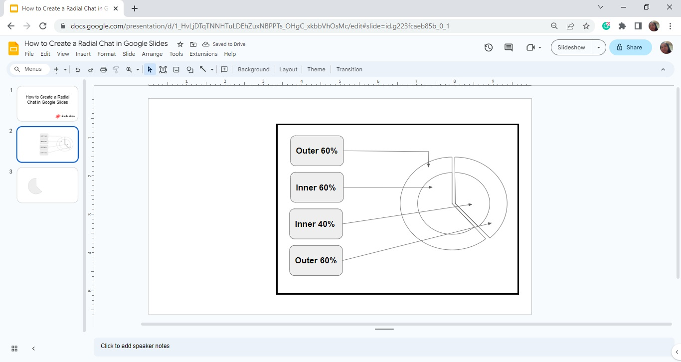
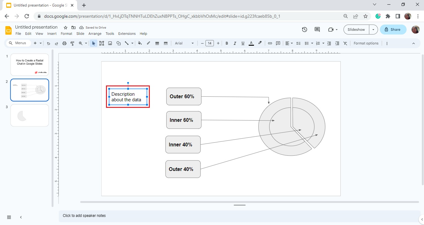
Add Labels to Your Radial Chart
To add a label to your radial chart, follow these instructions:
-
Select the presentation slide with your radial chart template, then go to the "Insert" menu.
-
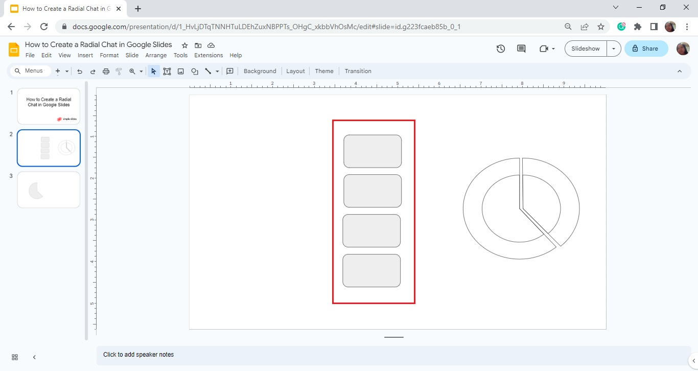
Click "Shape" from the list and select "Shapes" from the context menu. Then, choose the rounded rectangle as your text box for your Google Slides radial chart.
-
Click and drag it to your slide deck, then duplicate it for the other half of your radial chart.
-
Select "Line" from the toolbar section and connect the text boxes to your radial chart in Google Slides.
-
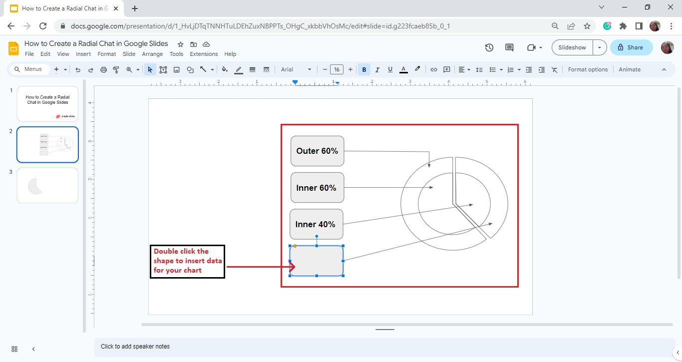
Double-click the shape on your slide deck to add text within the rounded shape and start typing the details.
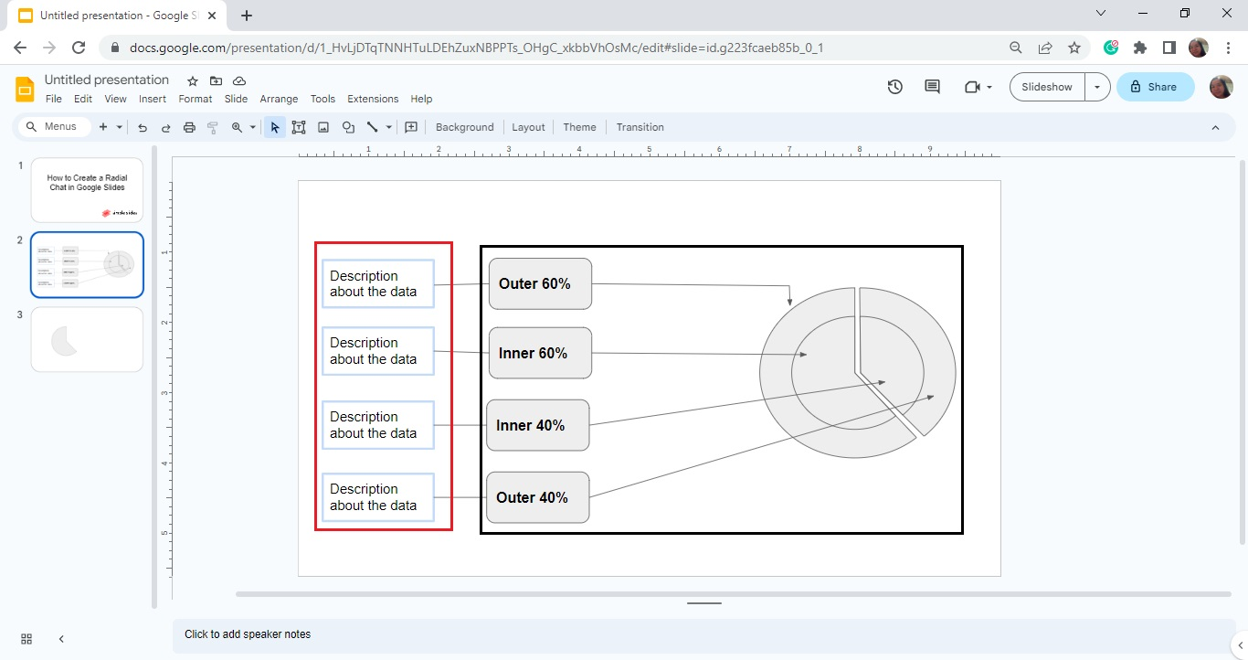
Add Chart Titles and Information Text Boxes to Your Radial Diagram
Suppose you want to add titles and other descriptive data labels to your Google Slides radial chart. All you need to do is:
-
Go to the "Insert" menu and select "Text box."
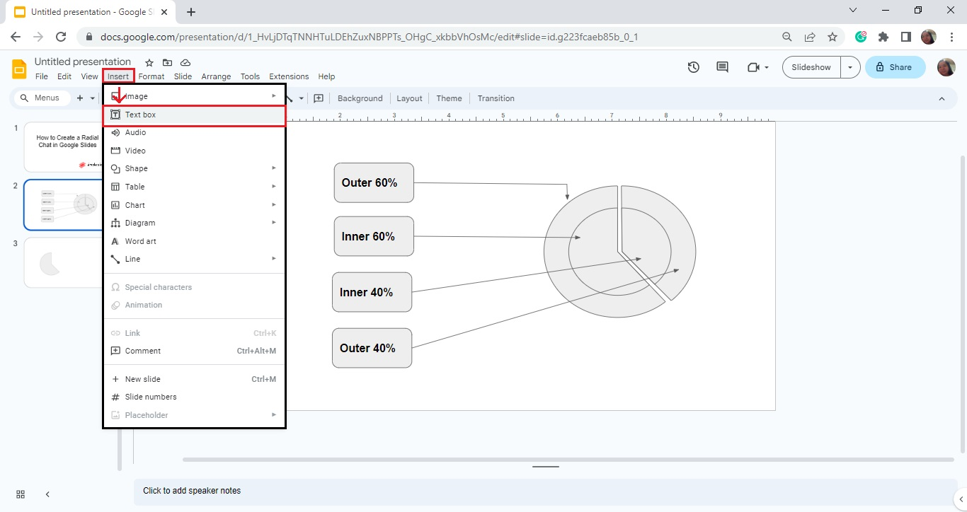
-
Click and drag the text box to your preferred position on your slide deck.
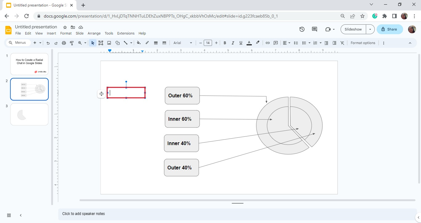
-
Start typing the information you want to appear on your radial chart.
-
Duplicate the same "text box" to insert data labels to the other portion of your radial chart in Google Slides.
Customize the Outer Body and Inner Body of Your Radial Chart
To customize the outer and inner body of your radial chart in Google Slides, follow these steps:
-
Select the outer body of your pie chart and click "Fill Color" on the toolbar section.
-
From the drop-down menu, select a specific color you want to use for the outer body.
-
Finally, repeat Steps 1 and 2 for the radial chart's inner body.
Note: You can also change your radial chart's font size, border, and line color by selecting options from your toolbar section.
Final Thoughts on How to Make a Radial Chart in Google Slides
Have a creative visual representation of your data by learning to make radial charts on Google Slides. By following the steps we shared in this article, you will have an effective way to interpret business data.
For more Microsoft PowerPoint and Google Slides templates, check out Simple Slides' 10,000+ customizable infographics, templates, icons, and slides. Subscribe to the Simple Slides YouTube channel for free to watch Google Slides tutorials.
Frequently Asked Questions About Making Radial Diagrams on Google Slides:
What is a spider chart?
Spider charts, or radar charts, represent multivariate data on a two-dimensional chart. Moreover, they show multiple variables on axes that start at the same location.
Can I insert a chart from Google Sheets into a Google Slides presentation?
You can insert a chart from Google Sheets document in Google Slides by copying and pasting the diagram.
What advantages do charts have for a business?
Multiple pieces of data can be graphically compared using charts. In business, people can understand and recall information more easily with charts.

Related Articles:
Embed Google Slides Presentation In 5 Easy Steps
How To Add a Comment On Google Slides in 6 Easy Steps
Learn How To Insert a Diagram In Google Slides
Get A Free Sample of Our Award-Winning PowerPoint Templates + University
Get A Free Sample of Our Award-Winning PowerPoint Templates + University
Join our mailing list to receive the latest news and updates from our team.
Don't worry, your information will not be shared.
We hate SPAM. We will never sell your information, for any reason.