
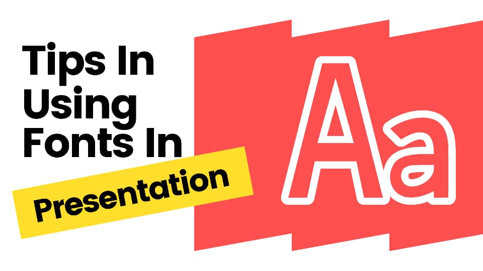
How To Use Fonts in Presentations
Sep 12, 2022
To create an excellent slide deck, you must consider all elements closely.
Your fonts are one of the elements you can't afford to get wrong because they can make or break your presentation. As a result, you must choose them carefully.
You can read this article to learn all there is to know about fonts, including the different types and how to pick and combine them effectively.

Types of Fonts.
When creating your slide deck, you must choose between three fonts. Let's take a look at each of them:
Serif Fonts.
A serif font is a font that has a small line at the ends of the letters. The roots of this typeface have been traced back to Greek and Latin writing.
Some of the most widely used serif fonts include Times New Roman, Garamond, Baskerville, and Georgia. These traditional fonts are considered more legible in print but aren't the most when projected.
As a result, you should be careful when using a serif font in your slides. Most experienced prefer using serif fonts in their titles because the letters are more significant.
Sans Serif Fonts.
A sans serif font is a font that has no line attached to the end of the letters. Sans serif typefaces existed before the 18th century but weren't widely accepted until the 1920s.
Today's most widely used sans serif fonts are Arial, Calibri, Century Gothic, Futura, and Helvetica. Thanks to the high readability of sans serifs, they are used for titles and body texts as a presentation font.
Script Font.
A script font is a font in which the texts appear handwritten. The two categories of script fonts available are formal and casual script fonts.
Examples of script fonts include Edwardian Script, Sophia Ronald, Madina Script, Bon Vivant, and Papyrus. Presenters hardly use script fonts as presentation fonts due to their poor readability.
What Is the Right Size for a Presentation Font?
No one has a straightforward answer to this question due to the uniqueness of each presentation. To find the best font size for a display, consider two factors. These are the size of the projection screen and the room.
Additionally, the size of your header font should be 32 or higher, while your body font should be between 24 and 32 pts.
Check out this professionally-designed stage-gate process template.
Improving Your Fonts With Effects.
You can add effects to your fonts to draw attention to your texts. Here are some of the font effects you can use:
Bold.
Bold is an effect that thickens the lines of letters and makes them more visible. You can use a bold font on your titles, headers, or any text you want to stand out. However, bold fonts don't look so different from regular fonts when projected on screens.
Italic.
Italic is an effect that makes letters slant to the right. It is excellent for highlighting and distinguishing texts but can be challenging to read. Hence, please don't use it frequently.
Underline.
Underline is used to draw a line underneath texts to highlight them. However, it appears to be outdated these days. If you use this effect in your slide, your audience will mostly think the texts contain a hyperlink.
Highlighting.
Highlighting is an excellent feature for making a portion of your slide stand out appealingly. It will allow you to add any color you desire to your text. Learn how to highlight texts in a Microsoft PowerPoint presentation.
Shadow.
As its name suggests, this effect adds a shadow to texts. Please stay away from this one because it is hard adequate.
All Caps.
The application of this effect will convert the highlighted texts to capital letters. It draws attention to texts but isn't one of the most appealing font effects.
Here is the most beautiful surprise birthday template.
Presentation Fonts Best Practices.

Here are some tips that will help you use presentation fonts like a pro:
Always Choose Legible Fonts.
Prioritize easily readable fonts, especially in the body text. Opt for fonts your audience can read effortlessly, regardless of where they are sitting.
An excellent way to determine the readability of a font is to imagine what it will look like when projected. Will your audience be able to read it easily?
Yes? Continue.
No? Find something else.
Less Is More.
Less is more with presentation fonts. The more fonts you add to your slide deck, the less coherent it will appear.
Your slides will appear confusing because your audience won't know what you are trying to highlight. To avoid such a situation, always ensure you have a purpose for every new font you use.
Don't Use Identical Fonts.
Remember that we use multiple fonts on one slide to draw attention to certain parts of the slide. Your audience will notice the change in the fonts and realize that you are passing a message.
However, this won't happen if you use identical fonts. It would be best if you used contrasting yet well-balanced fonts to ensure that your audience notices the message you are emphasizing.
How can you achieve that? Easy! Combine a serif font and a sans-serif font. Despite their differences, these typefaces complement one another excellently.
Colors Can Be Tricky.
After selecting well-balanced fonts, you should choose your colors carefully. The wrong choice of colors can ruin all the good work you have done.
Ensure the colors you apply will be visible on the slide's background. For instance, your audience won't see your white texts if they are on a grey background. It would be best if you also considered the overall of your slide deck, the theme of the presentation, your audience, the lighting of the room, etc.
Embedding Fonts.
Before using custom fonts in your presentation, note that your presentation will appear differently when opened on a computer where the custom font hasn't been installed.
Fortunately, presentation software like Microsoft PowerPoint and Google Slides allows users to retain their desired font. After downloading your font file, you can learn how to embed fonts here.
Final Thoughts.
After reading this article, all you need to use presentation fonts like a pro is practice. You can also review our website for a free professionally-designed template for your upcoming PowerPoint presentation.
Frequently Asked Questions:
Can you use any fonts for a presentation?
Your fonts will play a significant role in the readability of your presentation. Hence, you shouldn't use just any font.
What fonts should you use in your presentation?
The best fonts for your presentation should be easy to read.
Which is the most popular sans-serif font?
Arial is the most popular sans-serif font.

Related Articles
How To Change Fonts in PowerPoint
Get A Free Sample of Our Award-Winning PowerPoint Templates + University
Get A Free Sample of Our Award-Winning PowerPoint Templates + University
Join our mailing list to receive the latest news and updates from our team.
Don't worry, your information will not be shared.
We hate SPAM. We will never sell your information, for any reason.