How To Create Graphs and Charts in PowerPoint
Aug 16, 2022
Would you go through an enormous spreadsheet or view charts and graphs?
Everyone will agree that the data in a graph or chart is easier to read. No one wants to read your complicated sheets before understanding your data.
So, why not learn how to create charts and graphs with PowerPoint?
We will tell you all you need to know to create charts and graphs using PowerPoint and also share design tips. So, let's get started right away.

Creating Your Charts and Graphs.
Follow these simple steps to build charts and graphs for your PowerPoint presentation:
Step 1: Insert Your Chart.
Open PowerPoint and go to the presentation you want to work on. Click on the Insert tab and select "Chart." The app will open the Insert Chart dialog box.
Step 2: Choose Chart Type.

The category list will be on the left-hand side. Please choose your preferred chart type from it. Meanwhile, you will find the different chart styles available on the right.
Click on "OK" to confirm your selection.
Step 3: Add Your Chart Data.
Your preferred chart will come on the screen along with an Excel spreadsheet. The sheet will contain default data.
You must update the Excel sheet to add your data to the chart.
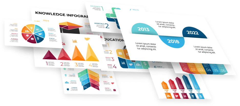
Check out these business infographics.
Entering Your Chart and Graph Data.
We will now show you how to add texts to your chart.
- Click on the chart and go to "Design."
- Select "Edit data" to open the Excel file.
- You can now edit the chart data or insert new columns and rows depending on your needs.
- Click on "Enter" to confirm the changes on your PowerPoint slide
Modifying Chart and Graph Styles.

Follow these steps to change the style of your charts and graphs:
- Click on the chart and go to "Design."
- Select "Change Chart Type"
- Select your preferred chart style from the pane
- Click O n "OK" to confirm your change
Here are the best decision tree templates today.
Making Your Graphs and Charts Stand Out.
Knowing how to create charts and graphs with PowerPoint is not enough. Also, learn how to make them stand out.
Here are some tips that will help you design better charts:
Try Different Chart Types.
PowerPoint has different types of charts for data visualization, and you should try to experiment as much as possible. You must ensure that your preferred chart type suits your data and makes it easy to read.

For instance, line charts display change over time, while column charts are ideal for comparisons.
Though there are more complex charts, you can use more straightforward options such as bar charts, line charts, and pie charts. Your audience is more likely to be familiar with a bar chart or pie chart and, as a result, understand your data faster.
You can also choose between a clustered column chart, clustered bar chart, stacked bar chart, etc.
Organize Your Data.
Before you start working on your charts in PowerPoint, ensure your data has been well-sorted. The process may be stressful and time-consuming, but it will set you up for success.
Take time organizing your data using an Excel Worksheet or Google Sheets.
Simplify and Declutter Your Chart.
To increase the readability of your chart, make essential elements more visible and remove unnecessary elements such as grid lines. Create significant contrast between your data and background elements.
It would also help to break down complex charts into smaller ones. If everything is squeezed into one slide, your chart will be challenging to read.
Take Colors Seriously.
Be careful with colors when creating your charts and graphs. For example, gray is the best color for making elements such as gridlines and axis labels less visible.
Brighter colors are used for highlighting data. However, it would help if you used a maximum of five colors in your chart. Also, consider opting for colors that are synonymous with your brand.
Additionally, note that colors have meanings. For instance, red and blue are mainly used to represent the political parties in the United States. Learn more about choosing colors for data visualization.
Finish in Style.
After doing all the hard work, you should do your best to complete your charts in style. Your chart's title should give your audience an idea of what it will show.
Keep things simple. Avoid having more than two charts in one slide to overburden your audience with content.
Additionally, customize your charts in line with the overall design of your presentation.
Final Thoughts.
This article will find all the information you need to create excellent charts and graphs. But if you are in a hurry, you can download our chart infographics. Our charts and graphs are fully editable and professionally designed. There's also something for every sector.
Frequently Asked Questions:
Can I create charts using PowerPoint?
PowerPoint has all the tools you need to create great charts and graphs.
How can I create a chart on PowerPoint?
Select Insert > Chart > Choose your preferred chart
How do you make an attractive graph in PowerPoint?
Keep things simple, remove clutters, use colors smartly, and be consistent with your design.

Related Articles:
How To Choose the Perfect PowerPoint Slide Size
How To Convert PowerPoint to Keynote
Benefits of a SWOT Analysis Template
Get A Free Sample of Our Award-Winning PowerPoint Templates + University
Get A Free Sample of Our Award-Winning PowerPoint Templates + University
Join our mailing list to receive the latest news and updates from our team.
Don't worry, your information will not be shared.
We hate SPAM. We will never sell your information, for any reason.