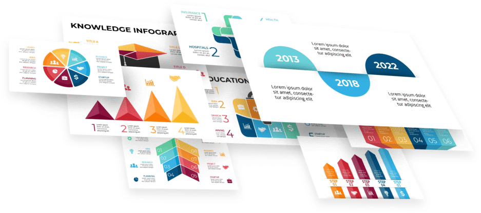
Charts For PowerPoint: Which one is Right for You?
Feb 18, 2023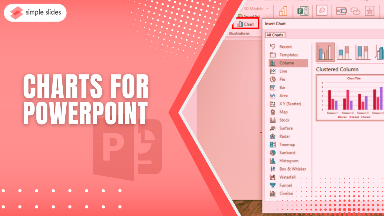
Have you ever considered which charts are perfect for your business reports presentations?
This article will look at the charts in PowerPoint and which one you should use for your data visualization and statistics.
In this article, we will discuss the different varieties of:
-
Use of PowerPoint charts and graphs.
-
The best charts for PowerPoint and their function.
-
Frequently asked questions on charts for PowerPoint:

Why should we use PowerPoint charts and graphs?
By using a chart in your PowerPoint, you can achieve a variety of functions, such as:
Creating a more appealing presentation.
Using a PowerPoint chart template to create your presentations, you can offer a visual aspect, making the content more engaging and digestible.
Improving Comprehension.
PowerPoint chart templates help you deliver detailed reports and data more manageable and straightforwardly so your viewer and listener can better convey the information.
Also, you can present your numerical data reports in a clear format to showcase the comparison and difference of each data.
Emphasizing important details.
With PowerPoint charts, you can highlight key points in your presentations. You can also use them to analyze the final data and point out the relevant patterns and trends to your marketing strategies.
The Best Charts for PowerPoint and Their Function.
The following are the different chart types available on the PowerPoint chart template:
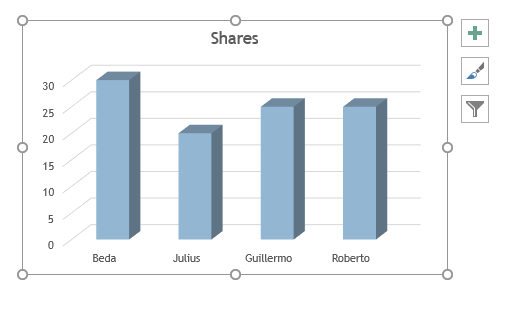
Column chart.
Column charts are pre-designed vertical bars that represent data. It usually lets you compare some particular product through its trend analysis.
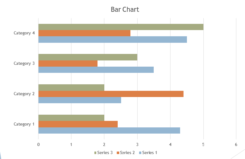
Bar chart.
Bar, also known as a column chart, is one of the most used PowerPoint charts in presenting any fluctuations and trends of your business over a certain period.
Bar charts and graphs are designed to compare survey percentages and rankings.
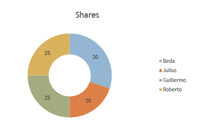
Pie chart.
A pie chart shows proportions of 100% by presenting it as a percentage segment. It is also a unique chart that shows a chart data illustration of pie slices for relative data size.
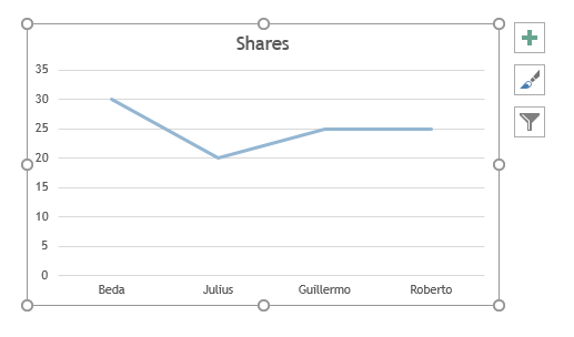
Line chart.
Line charts are frequently used in finance, ideal for displaying trends or any developments for your company. You can also merge some line graphs to compare immediately.
Line charts give every trader and business owner an illustration of how their company stock prices have been performing for a given time.
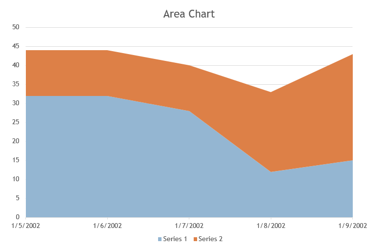
Area chart.
Area charts combine Line and Bar charts to convey two or more groups of numeric value change over any variable growth. You can compare data sets of reports through area charts because of the shading between the lines and the baseline of bar charts.
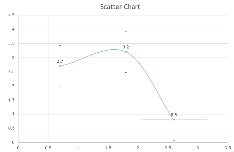
Scatter charts.
Scatter plots are charts and graphs that represent the relationship between the x and y variables in a data set. This chart is usually plotted in a Cartesian plane where X-axis acts as the independent variable, and Y-axis acts as the dependent variable.
There are three types of Scatter charts, such as:
-
U-shape
-
Exponential
-
Linear
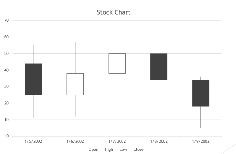 Stock charts.
A stock chart is a type of bar chart that shows the difference in the value of the stocks at a given time. Where it has four different illustrations stock that includes;
-
High-Low-Close
-
Open-High-Low-Close
-
Volume-High-Low-Close
-
Volume-Open-High-Low-Close
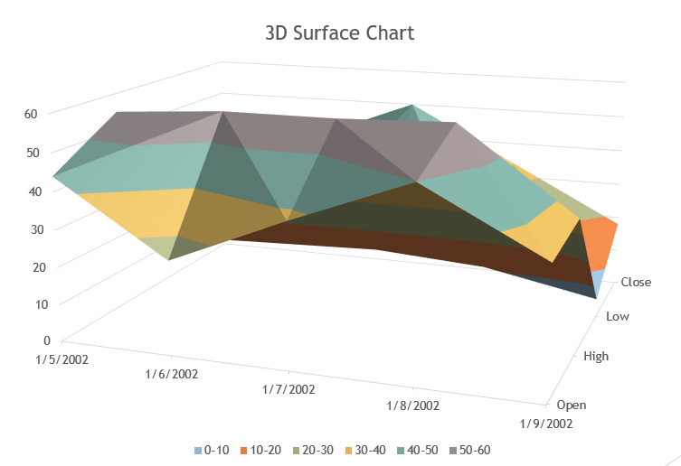
3D Surface Chart.
Surface charts are a plot of data set in the form of a surface. It helps find the best combination of two data sets.
These charts and graphs work with large numbers of the data set, allowing you to see a different perspective of the same information.
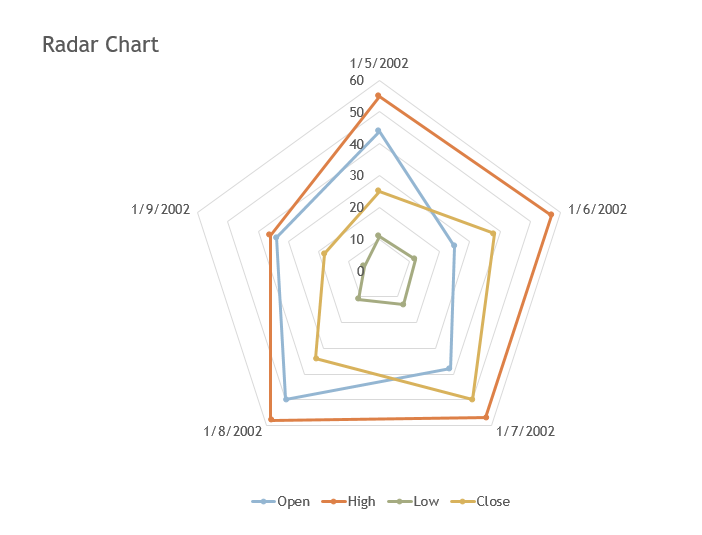

Radar chart.
A radar chart is a graphical illustration that compares three or more quantitative variables in the Cartesian plane.
With a radar chart, you can differentiate three to nine data sets in one chart, which helps you spot the criterion for data visualization.
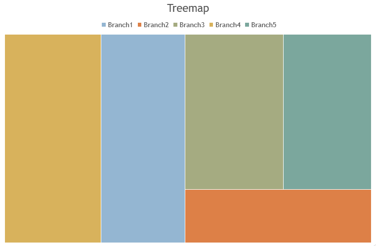
Treemap.
Treemap is usually used for data visualization of complex ranking because it can represent the proportion of data categories, making it easy to differentiate the significant contributor factor.
A treemap is a hierarchical data visualization where each node can have no or one parent.
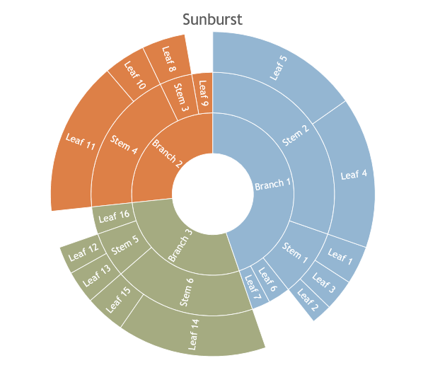
Sunburst chart.
Sunburst is a hierarchical data where a ring or a circle represents each rank level, and the inner center of the circle or ring is considered the top.
A sunburst works if you have multi-levels of data sets. For instance, if you need to compare two or three pie charts using Sunburst, you can reduce and avoid impractical effort and improve your work.
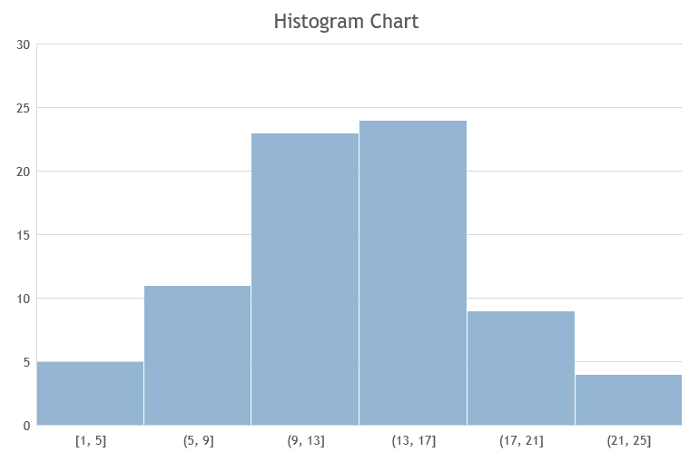
Histogram chart.
A histogram chart measures the interval scale in discreet and continuous data. It helps provide a convenient visual representation of the main characteristics of data distribution.
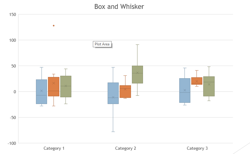
Box & Whisker charts.
Box and Whisker plot, or "Box plot," is a graphical illustration showcasing a different data set. A histogram can provide a clear representation, but a box and whisker plot includes more information. It allows many data series to display on the same chart.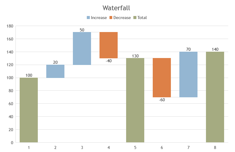
Waterfall charts.
Using waterfall charts, you can show how a starting value affects after you add and subtract any values. Each column in the waterfall charts is color-coded so that you can differentiate the positive and negative values in the chart.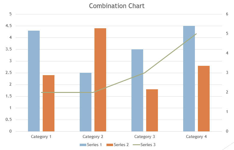
Combo chart.
A Combo or combination chart is a union of two columns and two line charts with a standard string field. It outlines to spot the difference between the four or more data sets to show the correlation.
Final Thoughts about Charts for PowerPoint.
Now you have all the information you need to choose the perfect chart for your presentation.
Remember to stay tuned in our blogs about PowerPoint in Simple Slides, and for more how-to-do blogs, click the link below!
Frequently Asked Questions on Charts for PowerPoint:
How can I insert charts in PowerPoint?
-
Open a PowerPoint presentation on your Computer.
-
In the PowerPoint, navigate and select the "Insert" tab.
-
In the "Insert" tab, click the "Chart" icon.
-
A dialog box for "Insert chart" will open; select a particular type of chart you want to use in your presentation and double-click it.
How can I link my Excel graphs in PowerPoint?
- Go to your existing Excel file, where you make a graph in a data series.
-
Select and copy the graph templates in Excel, then open your PowerPoint.
-
Select a particular PowerPoint slide and directly paste it.

Related Articles:
How To Create Graphs and Charts in PowerPoint
RACI Chart: Its Role in Project Management
Organizational Chart: Definition, Types, Usage, and Template
Get A Free Sample of Our Award-Winning PowerPoint Templates + University
Get A Free Sample of Our Award-Winning PowerPoint Templates + University
Join our mailing list to receive the latest news and updates from our team.
Don't worry, your information will not be shared.
We hate SPAM. We will never sell your information, for any reason.