
Charts Infographics
Charts PowerPoint Bundle
We've designed Fully Editable PowerPoint Charts and Graph Templates to display business data and information. We have hundreds of hand crafted chart infographics designed to communicate the story of your data visually. There are charts for every sector imaginable. The high-quality vector design is also fully customizable and editing the size, shape, and color comes easy. Perfect for anyone who needs to represent meaningful data in an impactful way.
Get Access Now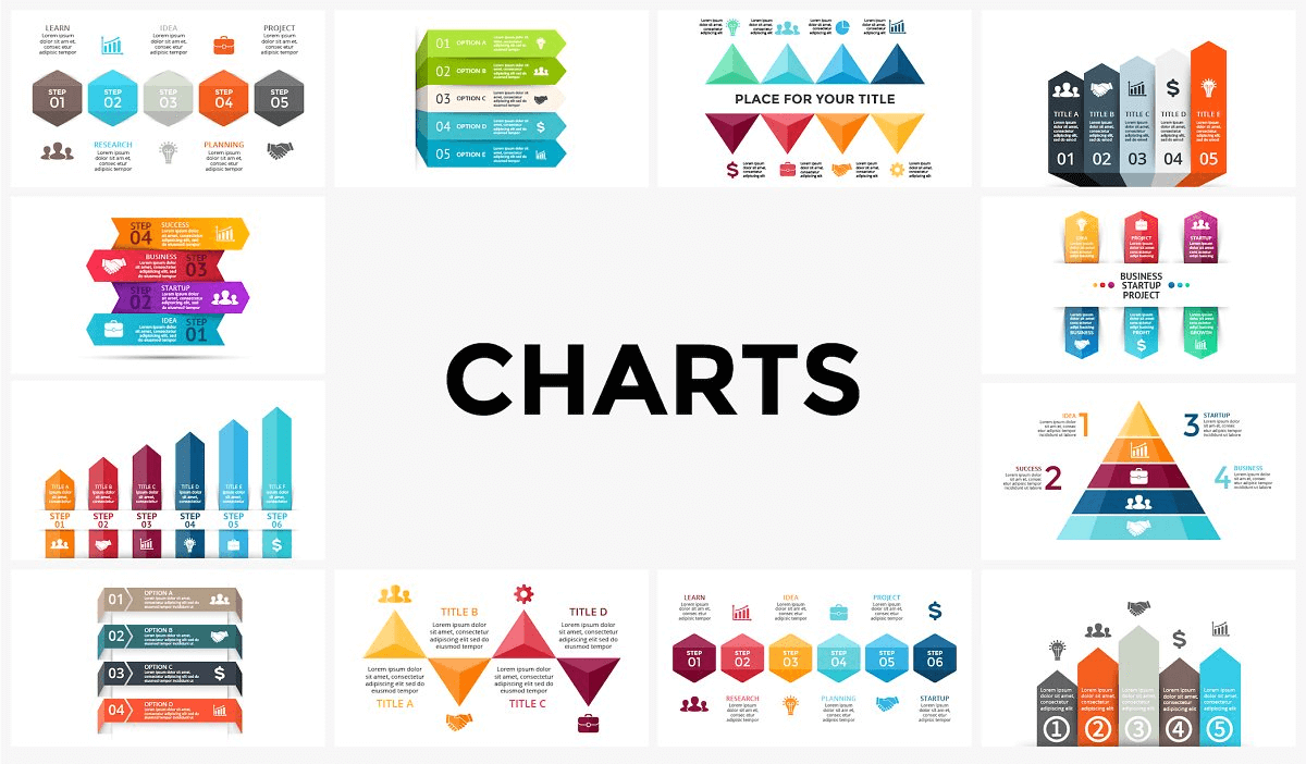
What's Inside the Chart Bundle?
Details | 53 Slides
Category | Business, Charts
Supported Versions | PowerPoint 2017, PowerPoint 2010, PowerPoint 2013, Office 365, Google Slides, Keynote
Tags | Business, Strategy, Data, Dashboard


Why Presenters Choose Simple Slides
It's simple. Access to the largest library of professionally designed infographics & slides, plus world-class training.

10,000+ Professional Presentation Templates
Optimized for use with PowerPoint, Google Slides & Keynote. Create presentations in minutes, not hours.

World-Class PowerPoint University
With our university, you'll learn how we make templates & deliver stunning presentations.

Easy to Edit
Use your favorite tool to edit your new slides. Compatible with PowerPoint, Google Slides & Keynote.
The Benefits of Using Chart Templates In Data Presentation | A Beginners Guide
What Are Chart Templates?
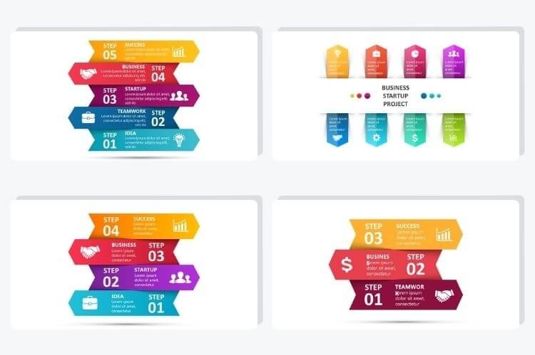
Chart templates are visual representations of data that are widely used by businesses and educators across the world. They help us to understand data quickly, and invite further explorations of topics that may be somewhat complicated or long-winded. When you implement chart templates in your presentations or meetings, your presentation gains clarity and authority, making you stand out to your audience.
Apart from carrying a great visual appeal, when you use appropriate and corresponding chart templates, your data presentation becomes much stronger and more impactful. Using chart templates to impart relevant information to your target audience in an arranged manner allows your core message to be boosted, solely by these visual illustrations.
Chart templates are an effective communication method that aids readers in understanding the content of the research conducted. They sustain your audience’s interest and effectively present large quantities of complex information.
But what else makes using chart templates such a big benefit in the world of data presentation?
- Chart templates present information in a concise, consistent, and compact style.
- They allow your audience to better grasp the meaning of the data and do so more efficiently.
- hart templates are visually more engaging than plain textual content. On top of that, your data presentation automatically becomes more appreciated.
- Making assessments of the facts become easier when given to professors or bosses, it will allow them to easily compare different data and numbers.
- They allow your prospective clients to make important decisions on the finer aspects of your business.
How Do I Make a Chart Template?
When first creating your chart template, you need to think about specific information that you would like your data presentation to support or the outcome that you’re looking to achieve.
The key is simplicity, don’t overdo it, or bombard your audience with data that will most likely keep them confused or uncertain. Also, make sure to not add any unnecessary elements that could potentially distract them from your presentation.
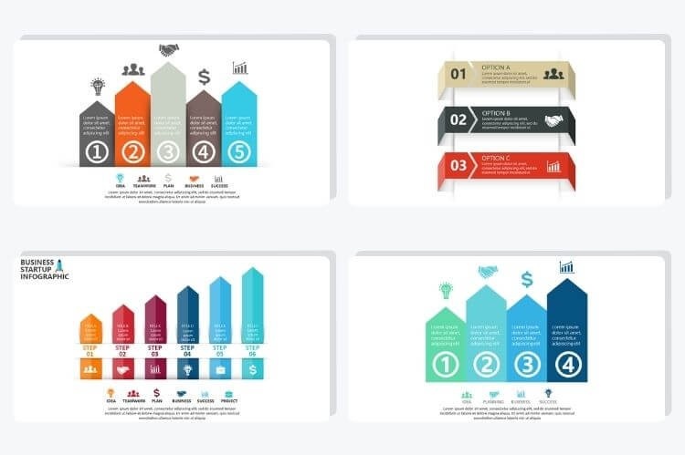
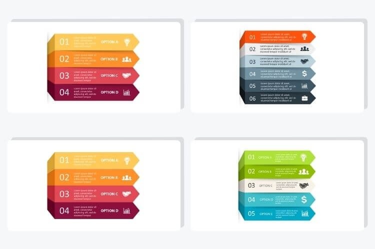
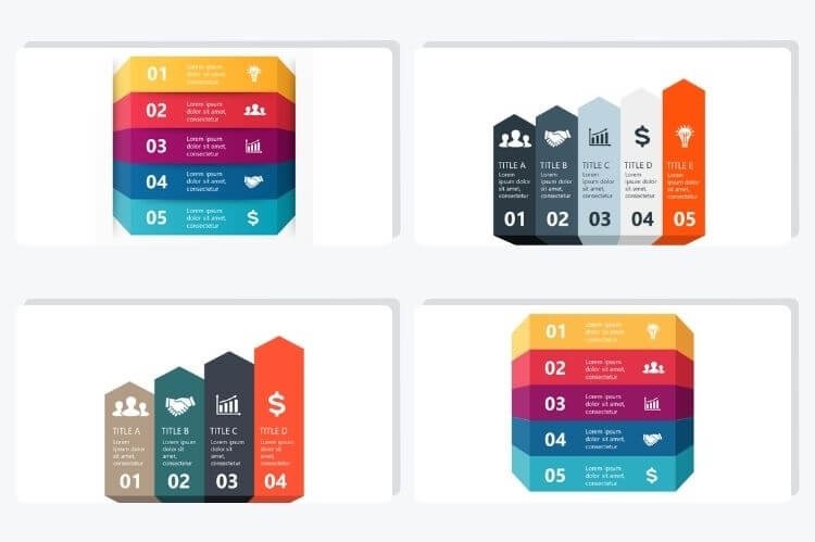
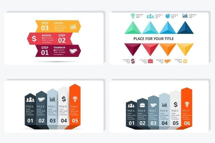
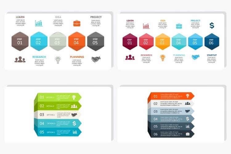
When it comes to the design, what type of chart template should you choose? By using Simple Slides handy chart templates, you’ll have up to 53 designs of charts that you can use for any data presented. Make sure to pick one that works best for your data, and captures your audience’s attention.
The Simple Slides platform blesses you with the ability to walk into any meeting confident, ready loaded with simplified, beautifully presented information; and fully prepared to answer any questions your audience might have. Download your chart template now and get working!
All in all, when you use chart templates, so much more can be said, and so many more facts can be accommodated and arranged in a terse manner.
That, my friends, is the beauty of chart templates in a data presentation.
Simple Pricing for Full Access
Unlock full access to the entire library for one low price.

